Post Grid Configuration Instructions
How to Add It to the Page
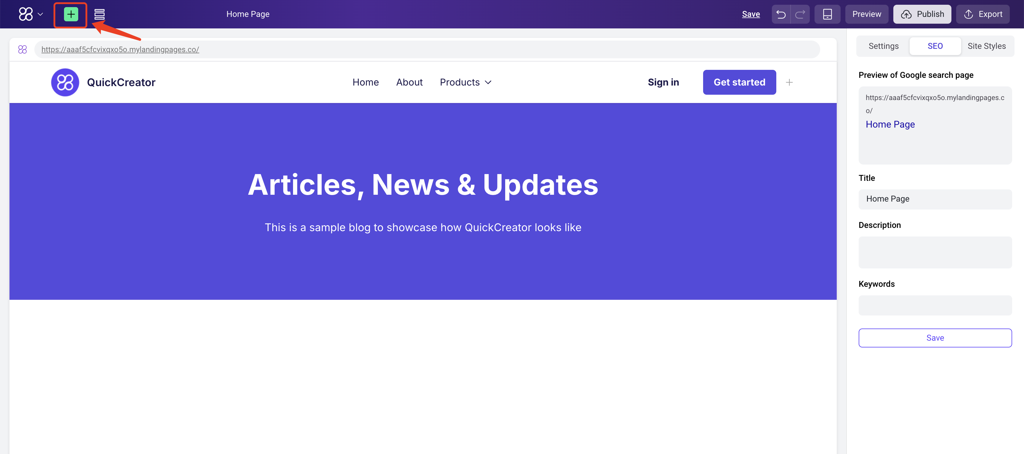
Enter the page editor and click the Add Block button at the top:
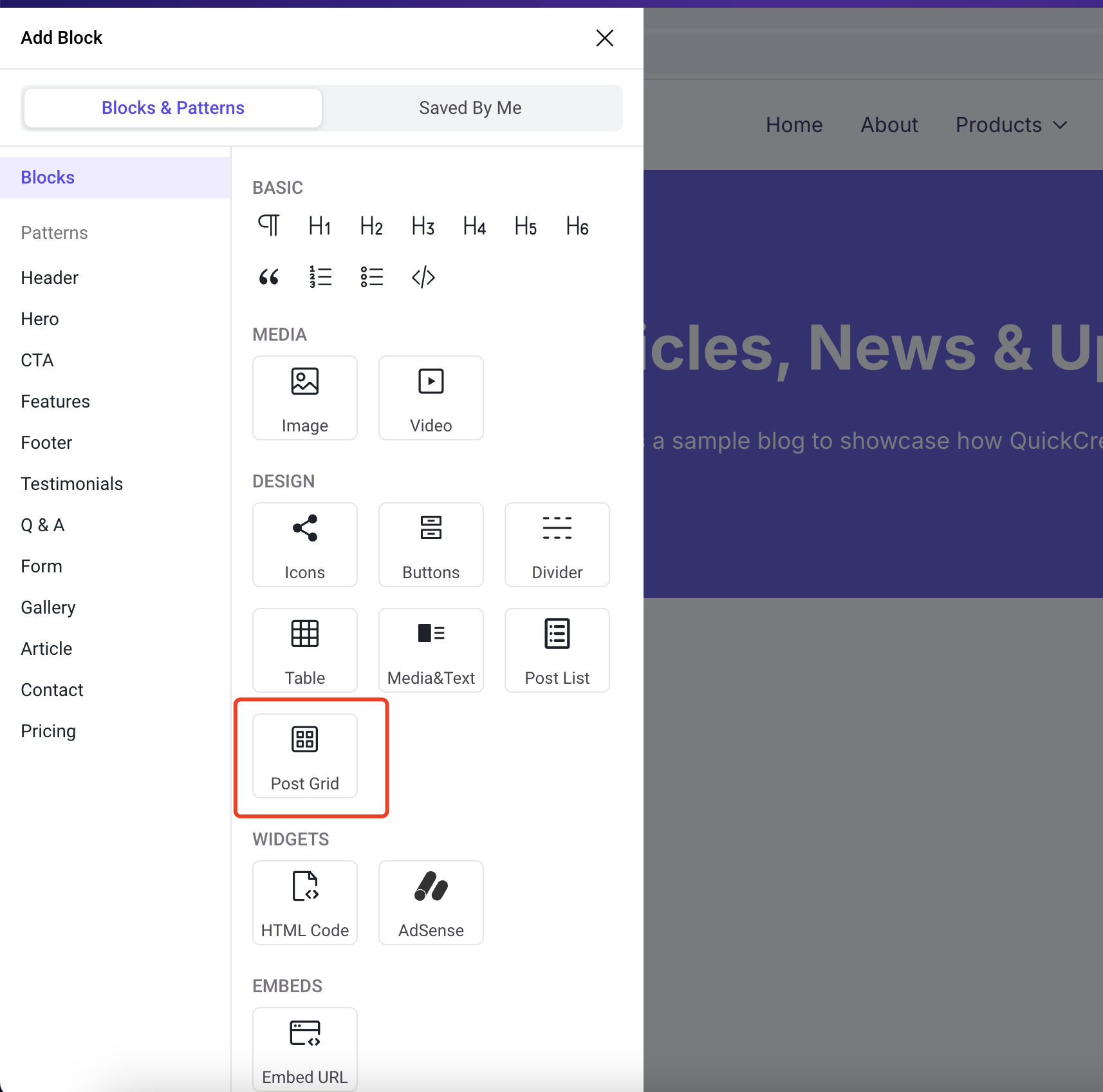
In the Blocks section, find the Post Grid module:
Click it to add it to the page:
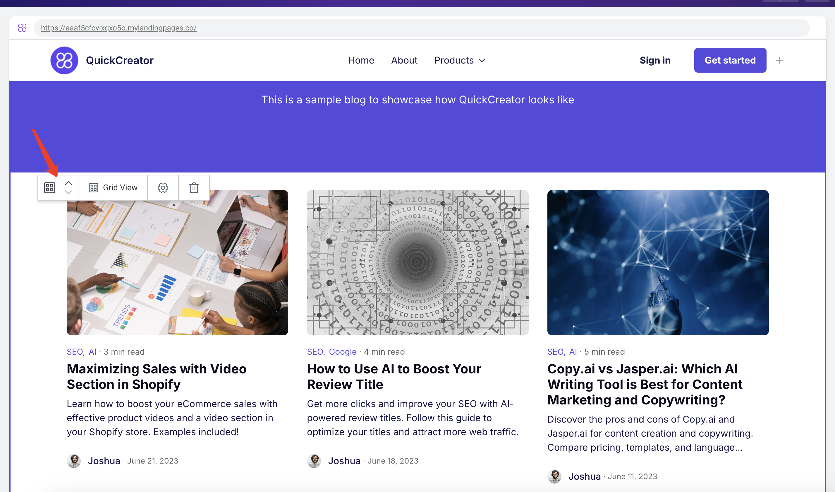
Configuration Instructions
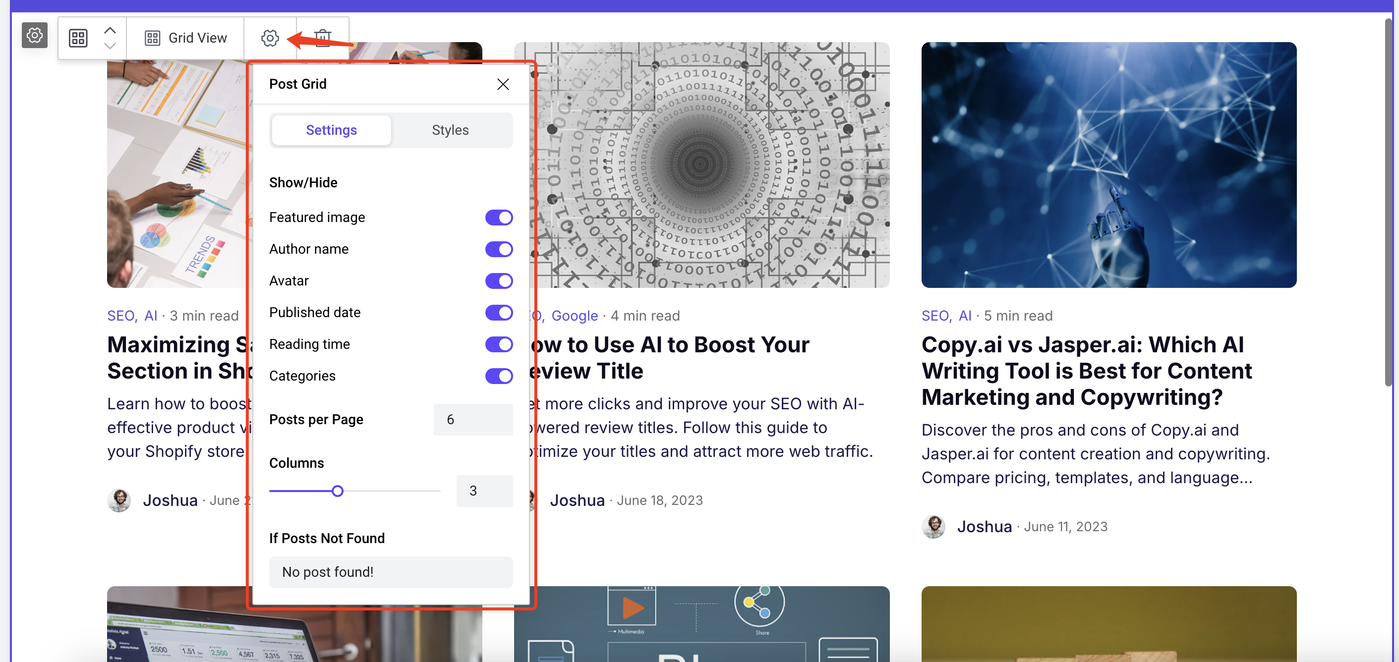
Show/Hide
Featured Image
This toggle controls whether the featured image in the grid card is displayed. Below is the effect when turned off:

Author name
This toggle controls whether the author’s name at the bottom of the card is displayed.
Avatar
This toggle controls whether the author’s avatar at the bottom of the card is displayed.
Published date
This toggle controls whether the published date, located to the right of the author’s name, is displayed.
Reading time
This toggle controls whether the reading time above the post title is displayed.
Categories
This toggle controls whether the category tags above the post title are displayed. If the post has no categories, this will not be shown.
Posts per Page
This value controls the number of post cards displayed on a page, with a default of 6.
Columns
This value controls the number of columns displayed in the grid, with a default of 3.
If Posts Not Found
This text will be displayed to users when no posts are found. You can modify this text to match the language of your website.
Card Styles
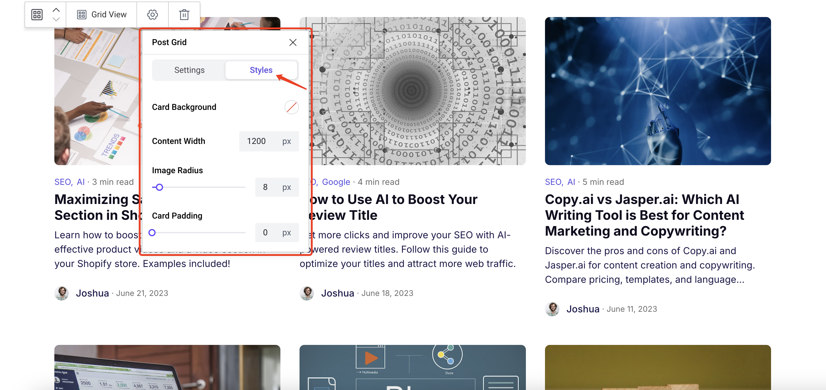
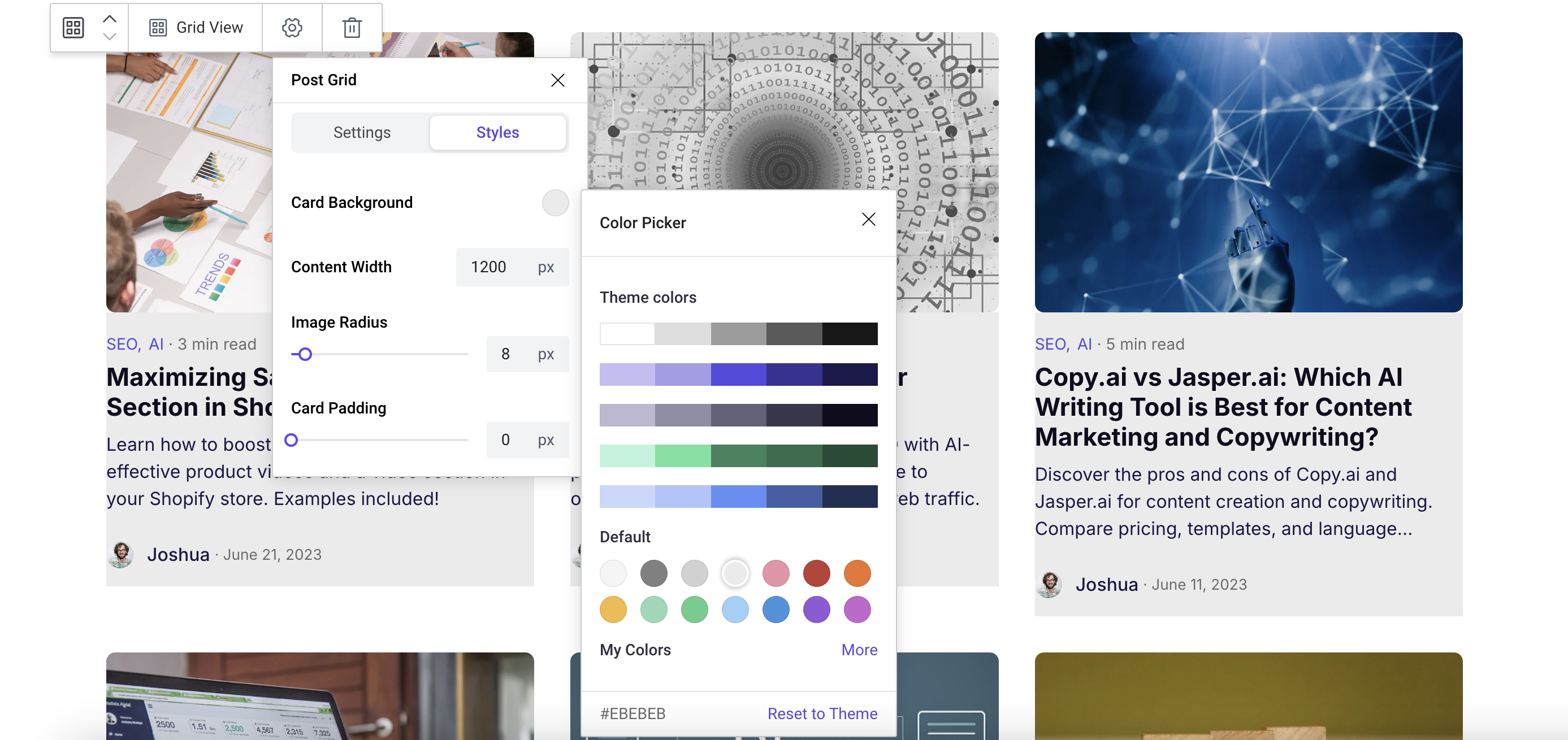
Card Background
This option controls the background color of the card, as shown below:
Content Width
This option controls the width of the entire grid content, with a default of 1200px. The effect after adjustment is shown below:
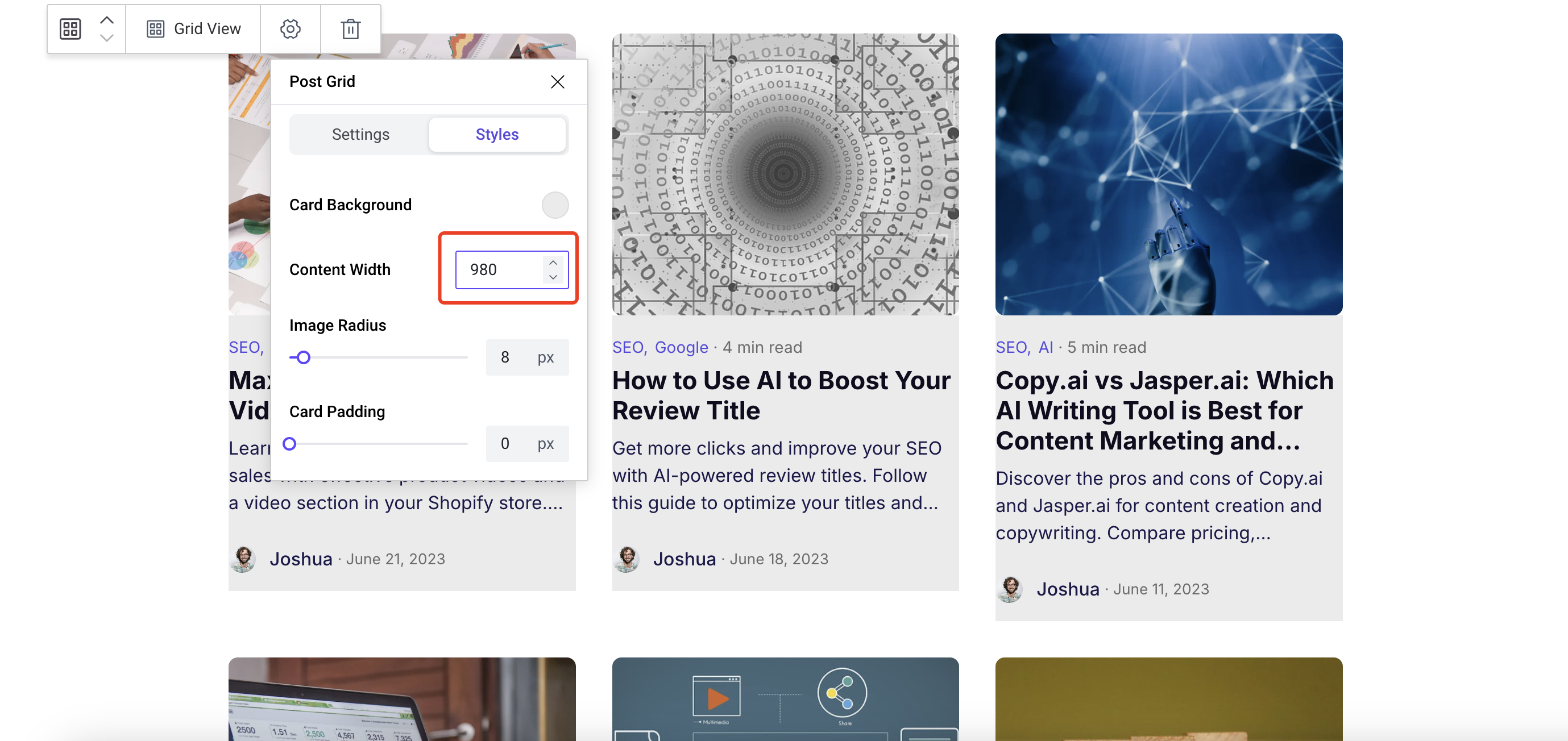
Image Radius
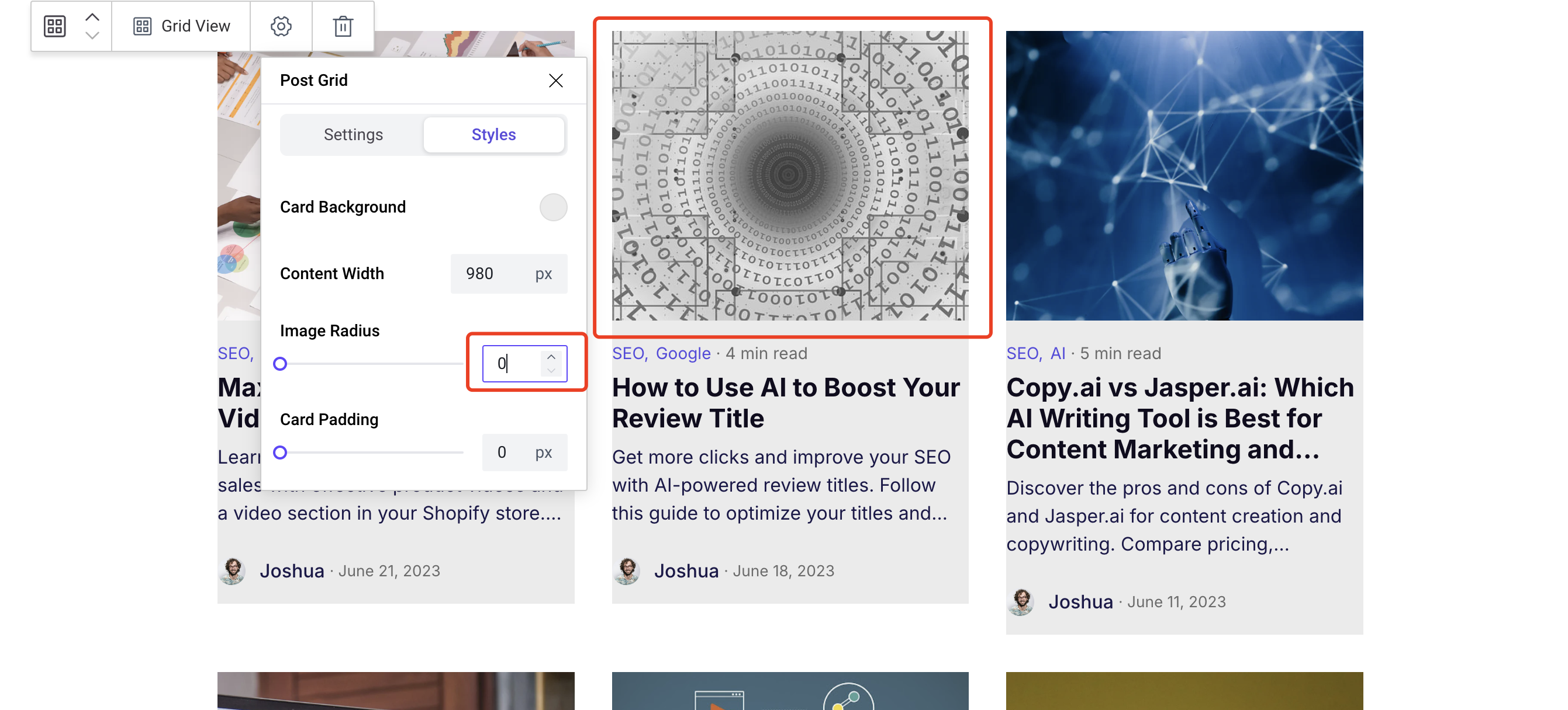
This option controls the border radius of the image. The effect after adjustment is shown below:
Card Padding
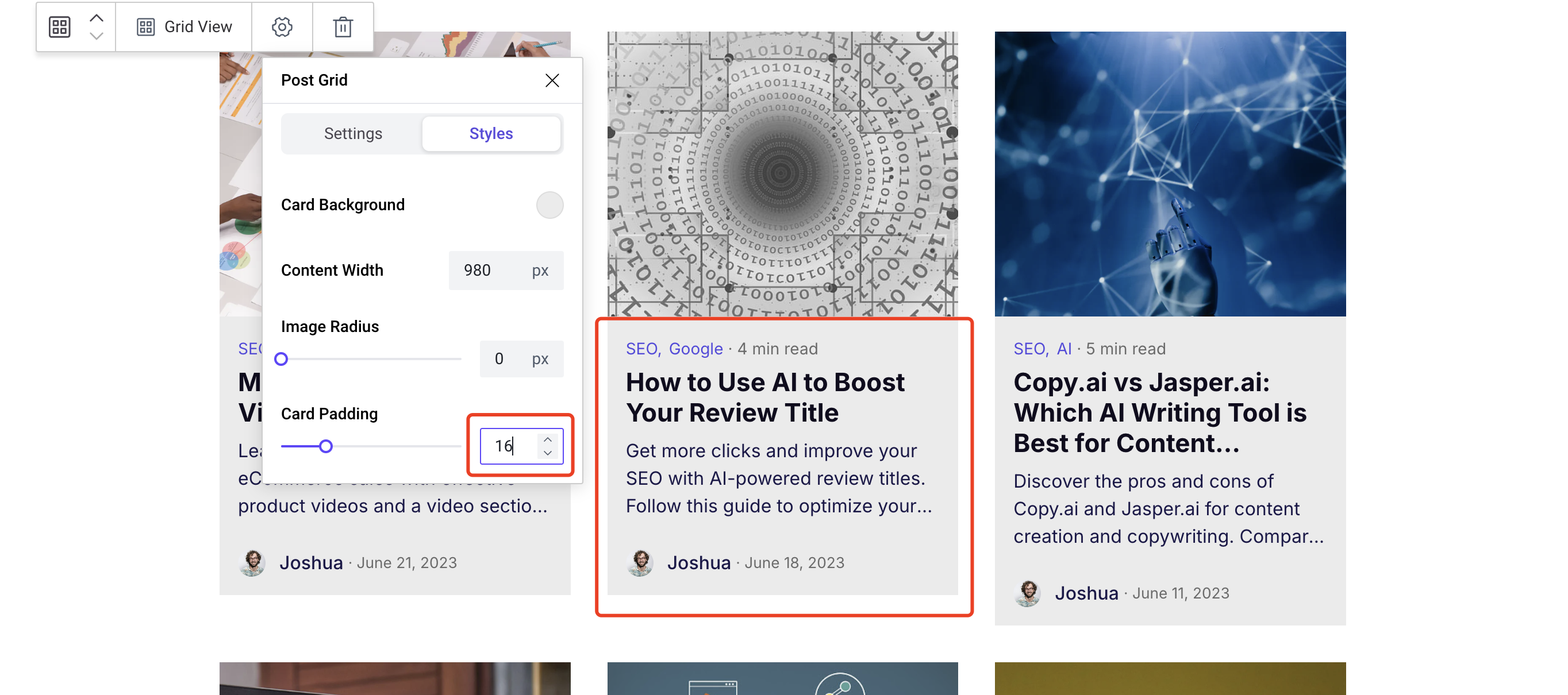
This option controls the padding inside the card content, usually used in conjunction with a card with a background color. The effect after adjustment is shown below:
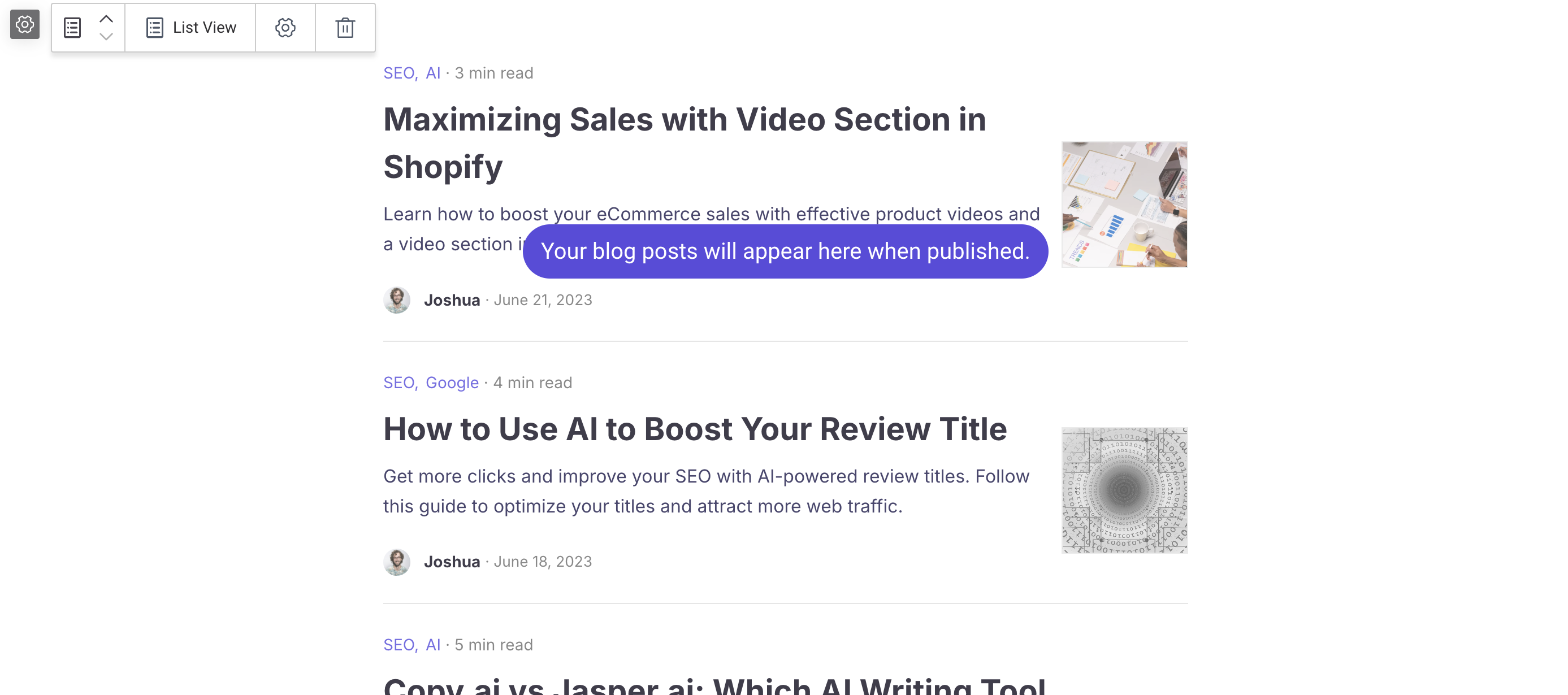
Quick Switch Between Grid and List Layouts
You can quickly switch between list and grid layouts without needing to delete and re-add the module. The steps are as follows:
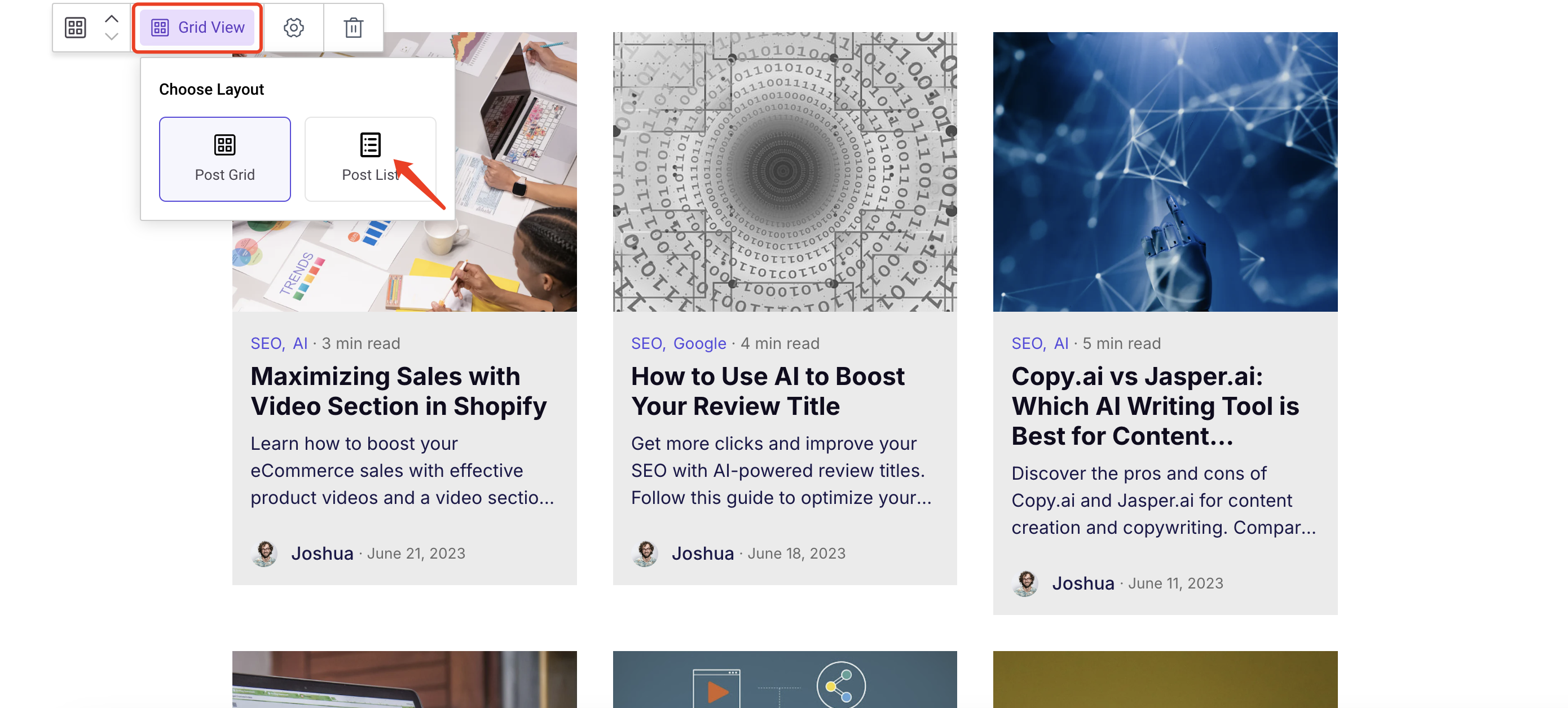
After clicking, it switches to a list layout:
